
How to Customize the Layout of your Shiny Apps
Learn how to control the layout of Shiny apps and improve how their look

Would you like to know how to fully customize the layout of your R shiny web applications in a easy way?
Today you will learn how to:
create a simple R Shiny User Interface (UI) Layout;
how to add a sidebar with inputs;
add multiple rows, columns, tabs and pages in R Shiny;
add a theme and fully customize colors and fonts;
and more…
Watch the video:
Load R packages
Before we begin, make sure you have the required packages installed:
install.packages(c("shiny", "tidyverse", "gt", "bslib"))Single Page Layout with Sidebar
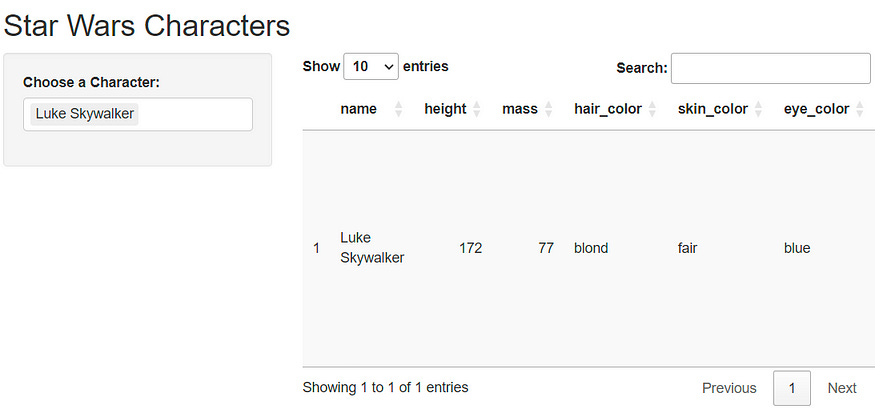
Let’s start with the most common Shiny layout pattern - a sidebar layout. This creates a clean interface with controls on the left and main content on the right.
library(shiny)
library(tidyverse)
library(gt)

ui <- fluidPage(
  titlePanel("Starwars Dashboard"),
  sidebarLayout(
    sidebarPanel(
      selectInput(
        inputId = "character",
        label = "Choose a Character:",
        choices = unique(starwars$name),
        selected = unique(starwars$name)[1],
        multiple = TRUE
      )
    ),
    mainPanel(
      gt::gt_output("characterInfos")
    )
  )
)

server <- function(input, output) {
  output$characterInfos <- gt::render_gt({
    dplyr::starwars %>%
      filter(name %in% input$character) %>%
      gt() %>%
      opt_interactive()
  })
}

shinyApp(ui = ui, server = server)
This layout demonstrates the fundamental structure of a Shiny application:
sidebarPanel: Contains input controls (in this case, a character selector)mainPanel: Displays the main content (an interactive table)Reactive filtering: The table updates automatically based on user selection
The sidebar layout is responsive and automatically adapts to different screen sizes, making it mobile-friendly.
Multi-Row Layouts with Grid System
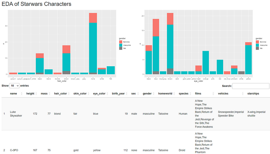
For more complex interfaces, you’ll need precise control over element positioning. Shiny uses Bootstrap’s 12-column grid system, allowing you to create custom layouts with multiple rows and columns.
ui <- fluidPage(
  titlePanel("Starwars Dashboard"),
  fluidRow(
    column(6, plotOutput("plot1")),
    column(6, plotOutput("plot2"))
  ),
  fluidRow(
    column(12, gt::gt_output("table"))
  )
)

server <- function(input, output) {
  output$plot1 <- renderPlot({
    starwars %>%
      count(hair_color, gender) %>%
      ggplot(aes(hair_color, n, fill = gender)) +
      geom_col()
    })
  output$plot2 <- renderPlot({
    starwars %>%
      count(eye_color, gender) %>%
      ggplot(aes(eye_color, n, fill = gender)) +
      geom_col()
    })
  output$table <- gt::render_gt({ starwars })
}

shinyApp(ui = ui, server = server)
Key concepts:
fluidRow(): Creates horizontal rowscolumn(width, ...): Defines column width (1-12) and contentBootstrap grid: Total width of 12 columns per row
Responsive design: Automatically stacks columns on smaller screens
In this example: - First row: Two plots side by side (6 columns each) - Second row: One full-width table (12 columns)
Tabbed Interfaces
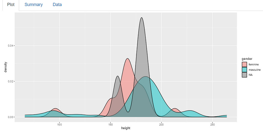
Tabs are perfect for organizing related content without overwhelming users. They provide a clean way to separate different views or analyses.
ui <- fluidPage(
  titlePanel("Starwars Dashboard"),
  tabsetPanel(
    tabPanel("Plot", plotOutput("plot")),
    tabPanel("Summary", verbatimTextOutput("summary")),
    tabPanel("Data", gt::gt_output("table"))
  )
)

server <- function(input, output) {
  output$table <- gt::render_gt({ starwars })
  output$summary <- renderPrint({ summary(starwars$height) })
  output$plot <- renderPlot({ ggplot(starwars, aes(x = height, fill = gender)) +
      geom_density(alpha = 0.5) })
}

shinyApp(ui = ui, server = server)
Tab components: - tabsetPanel(): Container for all tabs - tabPanel(title, content): Individual tab with title and content - Content flexibility: Each tab can contain any Shiny output
You can also combine tabs with the grid system by adding fluidRow() and column() within tab panels for even more layout control.
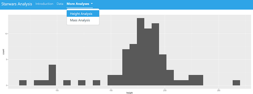
Multi-Page Applications with Navigation
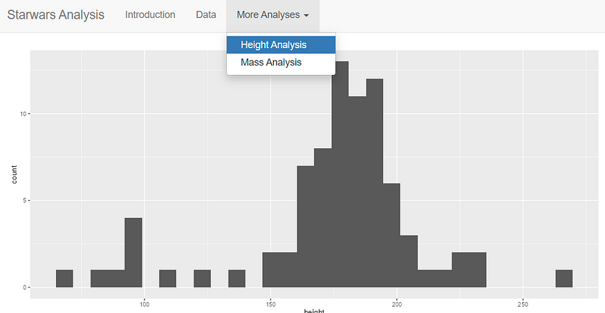
For larger applications, you might need multiple pages. The navbarPage() function creates a professional navigation bar at the top of your application.
ui <- navbarPage(
  title = "Starwars Dashboard",
  tabPanel("Introduction", p("An app for analyzing Starwars data.")),
  tabPanel("Data", gt::gt_output("dataTable")),
  navbarMenu("More Analyses",
             tabPanel("Height Analysis", plotOutput("heightPlot")),
             tabPanel("Mass Analysis", plotOutput("massPlot"))
  )
)

server <- function(input, output) {
  output$dataTable <- gt::render_gt({ gt(starwars) |> opt_interactive() })
  output$heightPlot <- renderPlot({ ggplot(starwars, aes(height)) + geom_histogram() })
  output$massPlot <- renderPlot({ ggplot(starwars, aes(mass)) + geom_histogram() })
}

shinyApp(ui = ui, server = server)
Navigation features: - navbarPage(): Creates the main navigation structure - tabPanel(): Individual pages in the navigation - navbarMenu(): Dropdown menus for grouping related pages - Professional appearance: Clean, modern navigation bar
Theming with Bootstrap
The bslib package provides easy access to pre-built Bootstrap themes, allowing you to quickly change your application’s appearance.
library(bslib)

ui <- navbarPage(
  title = "Starwars Dashboard",
  theme = bslib::bs_theme(bootswatch = "cerulean"), # BOOTSWATCH THEME
  tabPanel("Introduction", p("An app for analyzing Starwars data.")),
  tabPanel("Data", gt::gt_output("dataTable")),
  navbarMenu("More Analyses",
             tabPanel("Height Analysis", plotOutput("heightPlot")),
             tabPanel("Mass Analysis", plotOutput("massPlot"))
  )
)

server <- function(input, output) {
  output$dataTable <- gt::render_gt({ gt(starwars) |> opt_interactive() })
  output$heightPlot <- renderPlot({ ggplot(starwars, aes(height)) + geom_histogram() })
  output$massPlot <- renderPlot({ ggplot(starwars, aes(mass)) + geom_histogram() })
}

shinyApp(ui = ui, server = server)
Popular Bootswatch themes include: - cerulean (shown above) - flatly - darkly - cosmo - journal - lumen
Custom Color Schemes
For complete control over your application’s appearance, you can define custom colors and styling with bslib.
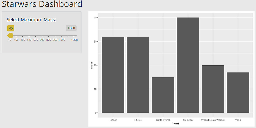
library(bslib)

ui <- fluidPage(
  theme = bslib::bs_theme(bg = "#E8E8E8", fg = "#242424", primary = "#D4B836"),
  titlePanel("Starwars Dashboard"),
  sidebarLayout(
    sidebarPanel(
      sliderInput("massInput", "Select Maximum Mass:",
                  min = min(starwars$mass, na.rm = TRUE),
                  max = max(starwars$mass, na.rm = TRUE),
                  value = 40)
    ),
    mainPanel(
      plotOutput("massPlot")
    )
  )
)

server <- function(input, output) {
  output$massPlot <- renderPlot({
    starwars %>%
      filter(mass <= input$massInput) %>%
      ggplot(aes(x = name, y = mass)) +
      geom_col()
  })
}

shinyApp(ui = ui, server = server)
Custom theme parameters: - bg: Background color - fg: Foreground (text) color
- primary: Primary accent color for buttons, links, etc. - Additional options: secondary, success, info, warning, danger
Conclusion
You now have the tools to create sophisticated Shiny layouts! Here’s what we covered:
Basic sidebar layouts for simple interfaces
Grid system with rows and columns for precise control
Tabbed interfaces to organize content
Multi-page navigation for complex applications
Theme customization for professional styling
See you in another tutorial!